Have you noticed it? The world seems to be losing its vibrancy, like someone slowly turned down the saturation. We’re drifting toward a world without colors, where everything feels a bit muted — from bland logos to gray city streets. Designers, researchers, and everyday people are all asking the same thing: why is the world so colorless?
And here’s the funny twist — even nature’s joining in. As people age, their hair goes gray too, almost like the world is matching its trend-setters. This piece unpacks why it’s happening and what it means.
“Bold colors get labeled childish, while muted tones are seen as serious and refined.”
1. Minimalist Design and the Rise of a Colorless World
Minimalism has taken over pretty much everything — our homes, our apps, our gadgets, even the buildings we walk past every day. And when people say “less is more,” what they usually mean is “less color.” Designers love clean lines, calm spaces, and neutral palettes because they feel modern and grown-up. It isn’t a new idea either. Early modernists like Adolf Loos literally preached that decoration was a crime, so bright hues slowly became “uncool.” Somewhere along the way, stripping things down became the default setting, and color got left behind.
This mindset still shapes what we see today. Black, white, and gray feel elegant, so bold colors get pushed aside as “too loud.” There’s even a word for it — chromophobia — the fear of using color in serious design. And while nobody’s quoting Plato while picking paint swatches, the effect is the same: creators keep choosing neutral because it feels safe, stylish, and universal. Put all of that together, and you can see how minimalism quietly pushed us towards world without colors without most of us even noticing.
“Minimalism quietly pushed us toward a colorless world without most of us even noticing.”
2. Bland Branding: Why the World Is Losing Color in Marketing
Branding used to be fun. Companies weren’t afraid to splash color everywhere, and bright logos were the easiest way to stand out. But now the trend has swung the other way. Most big brands have flattened their designs, softened their colors, and switched to safer black, white, or muted tones. This shift, often called “blandification,” comes from the fear of alienating anyone. A neutral logo works on every screen, every culture, and every Instagram feed. Luxury brands started it to look elegant, and everyone else copied the vibe.
The problem is that everything now looks almost identical. Unique fonts and bold hues have disappeared, replaced by the same calm gray-beige palette across entire industries. Experts call this “color conservatism,” a big contrast from the expressive branding of the past. In simple words, companies are playing it very safe. And that safety is a big part of why the world is losing color in marketing. Our shelves, apps, and ads are turning into one big monochrome mood.
3. Tech Trends and the Slow Move Toward a World Without Colors
Tech keeps getting smarter, but it’s also helping create a world without colors. Most of our devices today come in the same safe shades: black, white, silver, or gray. Apple helped set that tone years ago with its sleek white iPods and silver MacBooks, which instantly made neutrals feel modern and high-tech. Other brands copied the look, and before long, bold colors felt “unprofessional” unless the product was for kids. So the default became neutral everything, from laptops to headphones to home appliances.
The same thing happened in software. Early apps used bright icons and playful colors, but today almost every interface is flat, simple, and washed out. Even dark mode is just another path into a world without colors, flipping your screen to black and gray. Tech companies avoid bold shades to appeal to everyone, so our devices and digital spaces all end up looking the same. When your phone, apps, and gadgets all follow the same muted aesthetic, it’s no surprise everyday life feels like it’s sliding into monochrome.
Loving this piece about colors? Play our free color crossword and see how many shades you can name.
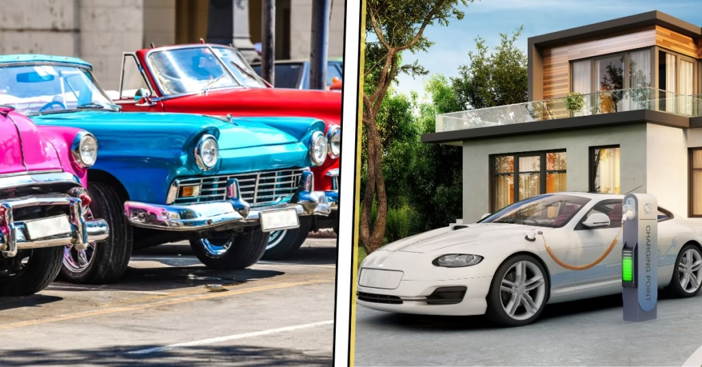
4. Gray on Four Wheels: Why the World Is Turning Gray on Our Roads
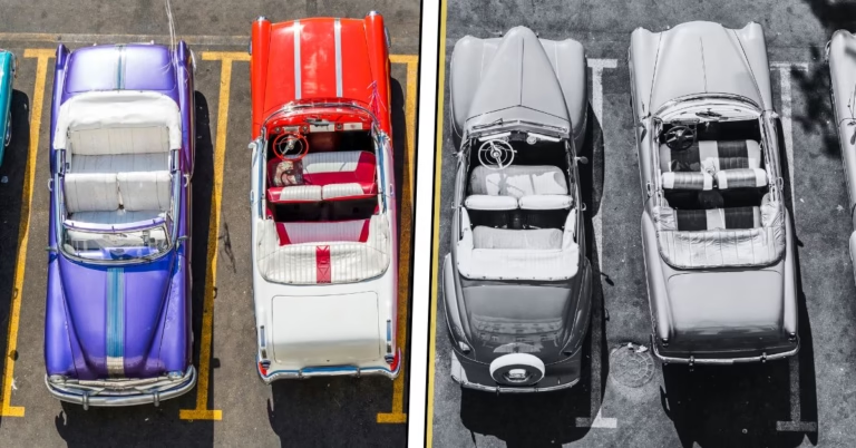
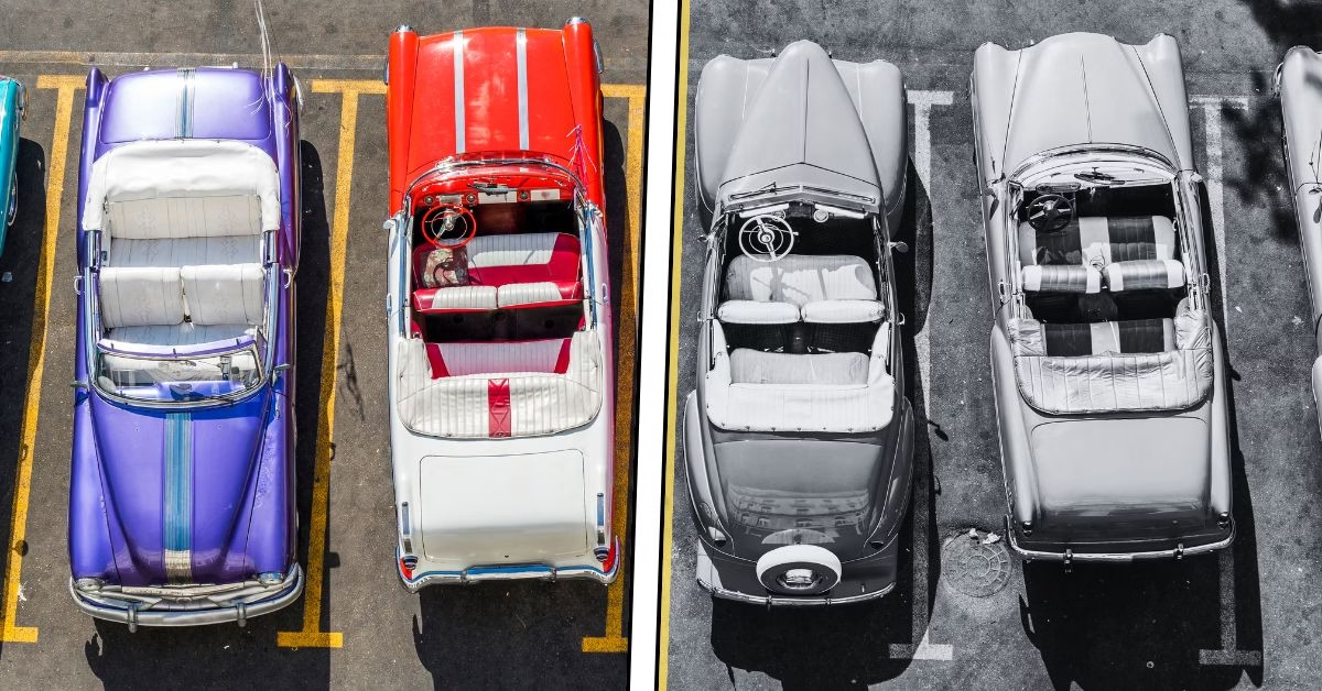
Look around a parking lot today and it feels like you’ve stepped into a black-and-white film. Cars once came in cherry reds, sunny yellows, sky blues, and deep greens, but now most are white, black, silver, or gray. Nearly 80% of new cars fall into that grayscale palette. The rainbow-on-wheels era has faded, and our roads have turned into one long monochrome stream — another clear sign we’re drifting toward a world without colors.
Why the shift? It’s mostly about playing safe. Neutral cars have better resale value, appeal to more buyers, and look “professional.” Automakers follow the trend too — minimalism is in, so flashy hues are out. Tech even influenced this; once white and silver became “modern,” car design leaned into that look. Combine all of that and you get lifeless, grayscale roads that feel like a permanent filter has settled over everyday life.
“Our roads now look like a permanent grayscale filter — another sign we’re drifting toward a world without colors.”
5. Fashion’s Neutral Era and Why the World Is Becoming Colorless
Open the average closet today and you’ll mostly see neutrals. Fashion has leaned hard into black coats, white sneakers, gray hoodies, and navy basics. It’s not that people dislike color — neutrals are simply the easiest way to look put-together. Capsule wardrobes pushed this even further. When everything is black, gray, or beige, it all matches without effort. Bright colors take confidence because they stand out and are harder to style.
Culturally, that pressure adds up. Bold shades can feel risky or too attention-grabbing, while neutrals feel polished and “grown-up.” Stores reflect that shift with racks full of whites, grays, and earth tones, and only a few pops of color tucked away. It’s practical and stylish, but it also makes crowds look the same. Fashion quietly joined tech and branding in the drift toward a world without colors.
6. Home Décor Trends and the Quiet Shift Towards A World Without Colors
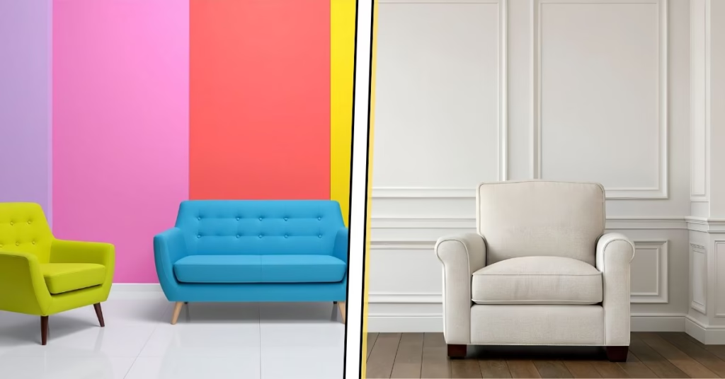
Walk into almost any modern home today and you’ll notice the same vibe instantly: white walls, gray sofas, beige rugs, maybe a tiny dash of navy if someone felt adventurous. Interior design has gone all-in on neutrals, and a lot of it comes from the real estate world. Agents always recommend light, simple colors because they appeal to the most buyers. So the quirky greens and patterned wallpapers of past decades disappeared, replaced by greige everything and endless white subway tile. It looks clean, it looks modern, but it definitely makes homes start to blend into one another.
Social media pushed this even further. Scroll through Instagram and every other bedroom looks like a soft beige cloud with a single plant for personality. Minimalism became the default because it photographs well and feels “timeless.” The downside is that our homes are beginning to look a bit like upscale waiting rooms — calm, tidy, and slightly empty. When every living room uses the same neutral palette, it’s hard not to feel like we’re heading toward a world without colors, one perfectly staged home at a time.
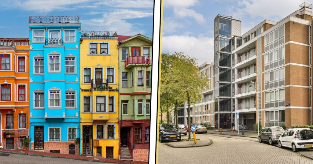
7. Architecture and Urban Life: A World Becoming Monochrome
Take a drive through any new suburb or office district and you’ll notice the same thing: gray buildings, glass boxes, steel frames, and not much else. The playful, colorful architecture of past decades has quietly faded out. Victorian houses, old-school diners, quirky storefronts — all replaced by neutral, boxy structures made of concrete, metal, and glass. Developers often leave these materials in their natural shades because it’s cheaper, easier to maintain, and considered “modern.” The result is block after block of silver and gray facades that blur together, no matter what city you’re in.
Globalization adds to that sameness. Architects reuse the same cost-efficient designs worldwide, and planners stick to safe palettes to avoid clashing with anything nearby. A bright building might fade, need upkeep, or stand out too much, while a gray slab stays the same for decades. Over time, whole districts end up washed in bland neutrals. It’s why so many skylines feel interchangeable now and why people keep asking why is the world turning gray when they look at today’s cities.
“Scroll Instagram and every bedroom looks like a soft beige cloud with one plant for personality.”
8. Fast Food Chains and Retail Spaces: Why Is the World Losing Color?
Fast food and retail used to be loud, colorful, and impossible to miss. Think bright red Pizza Hut roofs or Taco Bell’s purple-and-orange signs. Now most of that personality is gone. McDonald’s, Burger King, Taco Bell — almost every chain has traded playful colors for gray boxes and muted branding. Even Popeyes ditched its iconic orange for a charcoal look that fans joked made it resemble a dentist’s office. Drive-thrus everywhere now blend together: gray panels, brown accents, and nothing that hints at their once-fun identities.
Feeling inspired to bring color back? Try our free color palette generator and spark your next bold idea.
The reason is mostly business. Neutral buildings are cheaper, easier to maintain, and far simpler to repurpose if a franchise closes. A beige box can become anything; a bright red Wendy’s can only ever look like Wendy’s. Chains also want a “fast-casual” vibe, so they copy the same industrial, steel-and-wood aesthetic. The downside is sameness. The mascots, colors, and quirks that made these places memorable have quietly faded, adding one more reason the world is losing color and drifting toward sleek, grown-up gray.
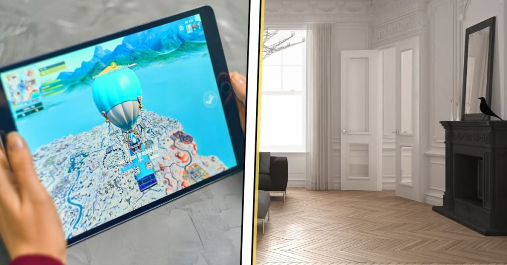
9. Colorful World Online and A Colorless World Offline
There’s a funny twist in the digital age: our screens are brighter than ever, while the world around us keeps getting duller. We spend hours staring at neon games, ultra-bright phones, and perfectly edited Instagram feeds, so real life naturally feels a bit washed out afterward. Our brains want a break, which is why beige walls and gray sofas start to feel like “visual white noise” after all that pixel overload.
Social media pushes this even further. Influencers use soft, desaturated filters that make beige look stylish, and we copy that look offline without thinking. Even films and TV now lean into muted color grading, making bright shades feel almost unusual. It creates a loop where digital life hoards the vibrancy and the real world becomes the calm, colorless zone — a big reason why there is a world without colors the moment we step away from our screens.
“Beige walls and gray sofas have become our ‘visual white noise’ after a day of pixel overload.”
10. Stress, Comfort, and A World Without Colors
Color and mood are closely linked, so when life gets stressful, our color choices shift too. Over the last few years, people have naturally gravitated toward calm, neutral tones because they feel safe and grounding. Psychologists note that during uncertain times — economic swings, global issues, everyday pressure — our brains look for simplicity and control. A beige living room or a gray hoodie doesn’t demand attention. It lets you breathe a little. Bright colors can feel too loud when everything else already feels overwhelming, so neutrals become the emotional comfort food of design.
This craving for stability shows up everywhere. Homes are painted in soft tones, brands tone down their packaging, and “daring” design takes a back seat while everyone tries to create their own little cocoon. Neutrals also carry that clean, orderly vibe that makes a space feel more manageable. It’s a simple way to take back control when the world feels chaotic. All of this makes it easy to see world without colors — not because we suddenly dislike it, but because calm feels easier to live in right now.
11. Playing It Safe: Why the World Is Becoming Colorless in Design Choices
A big reason everything keeps drifting toward gray is simple: nobody wants to stick out. People and brands play it safe because bold colors feel risky. A bright purple product might turn heads, but it could also turn buyers away. Even at home, someone may love a wild green but still choose tan because it feels safer. Black, white, and gray rarely offend anyone, which is why they’ve become the default.
This safety-first mindset has turned into quiet conformity. Bold color now feels rebellious, while neutrals blend in without effort. Social media amplifies it — if every influencer shows off a beige-perfect living room, your turquoise wall can suddenly feel “too much.” When every choice is the safe choice, the world ends up looking a little muted. It’s a big reason a world without colors has slowly become our norm.
“If every influencer’s home is beige, your bright turquoise wall suddenly feels ‘too much.’”
12. Social Media Aesthetics and a World Without Colors
Social media is one of the biggest drivers of muted aesthetics. Instagram, Pinterest, and TikTok made “aesthetic” basically synonymous with soft whites, gentle grays, and earthy neutrals. Influencers curate their feeds so every photo matches, and bright colors rarely fit that calm, polished look. So people filter out color online — and businesses follow offline. Cafes, boutiques, and offices design themselves to be “Instagrammable,” which usually means showcasing a world without colors. All there is to see are white tiles, black accents, plants, and plenty of beige.
Over time, real life began copying the online look. When a few big accounts lean neutral, everyone else imitates it, and the desaturated style spreads fast. Viral posts even show how much color the world has lost compared to past decades. It becomes a loop: social media rewards neutral, we decorate neutral, and the world looks neutral. It’s a major reason the world is becoming colorless — and breaking the cycle will take creators who bring color back.
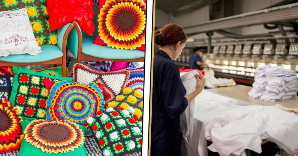
13. How Mass Production Is Making A World Without Colors
A lot of our color loss comes down to practicality. Mass production works best when everything is identical, so factories naturally choose neutral colors that are easy and cheap to replicate. This isn’t new. As manufacturing expanded in the 20th century, products shifted from vibrant, handcrafted hues to standard gray, beige, and taupe. A study from the UK’s Science Museum, which analyzed over 7,000 objects, even showed that consumer goods have been steadily neutralizing since the 1800s.
That logic still runs the show today. Companies selling products worldwide rely on a few safe colors that appeal everywhere. Some pigments are harder to source or regulate, so neutral materials become the default. Add in supply chains that favor uniform components, and you get aisles of gray gadgets and beige home goods. It’s a major reason the world is becoming colorless — neutral is simply easier and more efficient at scale.
“Mass production loves sameness, and sameness almost always means gray.”
14. When Color Feels Childish: Why the World Is Becoming Colorless
There’s a quiet cultural belief that bright colors are for kids and neutrals are for “grown-ups.” You see it everywhere: children’s rooms overflow with rainbows, while adult spaces lean into navy, black, white, and beige. Over time, muted tones became the symbols of luxury and seriousness, especially as Instagram pushed white-and-beige interiors as the adult standard.
That mindset affects everything. People avoid bold colors because they don’t feel “serious” enough, and brands do the same to look sleek and safe. Slowly, adulting started to equal grayscale. It’s a major reason the world is becoming colorless — not because we stopped liking color, but because we’re afraid it sends the wrong message.
15. Entertainment’s Muted Palette and a World Becoming Monochrome
Entertainment has quietly helped normalize muted color. Movies, shows, and games have shifted from the bright punch of old Technicolor films to darker, desaturated palettes. Prestige dramas and big blockbusters lean on cool blue or gray filters to feel “serious,” and we’ve gotten used to that look. Even Napoleon was shot on vibrant sets but toned down in post. Directors like Wes Anderson now stand out simply because they still use bold color, and gamers still joke about the gray-brown “realism phase” of the late 2000s.
This matters because media shapes what we see as “normal.” When screens constantly show gray as the realistic mood, colorful buildings or outfits can look almost cartoonish by comparison. While animation and a few franchises still embrace bright palettes, most entertainment sticks to muted tones. It reflects the cautious, minimalist mood of the moment — and reinforces a world becoming monochrome in real life.
16. Cultural Cycles: The Rebellion Against Our Parents’ Style
Every generation loves doing the exact opposite of the one before it, and color trends follow that same cycle. Many of us grew up with parents who adored bold carpets, patterned sofas, bright kitchen tiles, and a whole lot of color. We spent years rolling our eyes at those choices, so when it was our turn to decorate, we swung in the opposite direction. Neutrals felt modern, calm, and safely “adult.” It was an easy way to signal that we’d moved past the style we were raised with.
But cycles always flip. The next generation is already showing signs of rebelling against our beige-and-gray era, which means brighter palettes will likely make a comeback. What feels outdated to us now may look fresh to them later. It’s a good reminder that a trend toward a world without colors is never permanent — eventually, someone gets bored of the gray and brings the fun back.
“Every generation does the opposite of the one before it — and color trends are no exception.”
17. Earthy Tones and Why the World Is Becoming Colorless
After decades of neon plastics, glossy packaging, and synthetic everything, people started craving what feels natural and real. That shift brought earth tones into the spotlight — terracotta, olive, sand, clay, and warm browns suddenly became the new comfort colors. They feel calm, grounded, and a lot more honest than loud, artificial shades.
This move toward organic palettes isn’t bad, but it does push us further into softer, muted territory. When everyone chooses “nature-inspired” neutrals over bright dyes, everyday spaces quietly lose their vibrancy. It’s another reason the world is becoming colorless, even if the intention behind it comes from a place of wanting authenticity.
Conclusion: Will a World Without Colors Stay This Way?
It may feel like we’re stuck in a black-and-white film, but color isn’t gone for good. Trends always swing back, and you can already sense people getting bored of endless gray. Designers are reintroducing bold palettes, and brands are remembering that strong color actually boosts recognition and makes people feel something.
Little signs of a comeback are popping up everywhere. Fast-food chains are flirting with nostalgia again, fashion is getting louder, and creators online are ditching beige feeds for brighter, messier ones. Even interior designers are nudging people to add a splash of personality — or at least a pillow that isn’t gray.
As Johannes Itten said, “Color is life.” And honestly, he had a point — imagine an all-gray world and everyone’s hair going gray too. That’s too much grayscale for one planet.
Color isn’t gone. It’s just waiting for us to stop being shy and bring it back, one bold choice (or one purple lamp) at a time.